02 Telstra Connect
Customisable Dashboard for Telstra Connect
The Telstra Connect project commenced with an in-depth UX research and ideation phase, aimed at comprehensively understanding user needs and market dynamics. Initially, I developed user personas and user stories, enriched by insights gathered from targeted user interviews. This foundational work was supported by a thorough competitor analysis, providing a clear view of the market landscape.
Project type
UX Redesign
Company
Telstra
Location
Sydney, Australia
Industry
Tele Communication
Role
UX Strategist
Timeline
3 months
Introduction
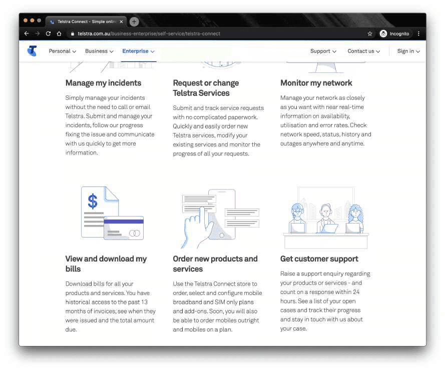
Telstra Connect is a self-service platform designed to offer Telstra's business and enterprise customers a centralised digital space to manage their telecommunications services efficiently. This service is specifically tailored to streamline the management of Telstra's products and services, providing a suite of features aimed at enhancing operational efficiency and simplifying the user experience.
01 Understand
What is Telstra Connect?
I began by identifying what Telstra Connect is and gaining an understanding of its overall purpose as a business self-service platform. I mapped out its core features, including order tracking, ticket management, service status updates, and account insights. This helped build a clear picture of the platform's functionality and how it supports business customers in managing their Telstra services.
User roles and pain points
Once I had a solid understanding of the platform and business goals. I turned to the users, defining key user roles and mapping out their pain points. This process helped surface meaningful user insights that informed experience improvements and design priorities.

02 Research
Competitors
I conducted competitor research to analyse how other telecommunication providers structure their digital products and customer experiences, identifying key UX patterns and opportunities relevant to Telstra’s offerings.

03 Define
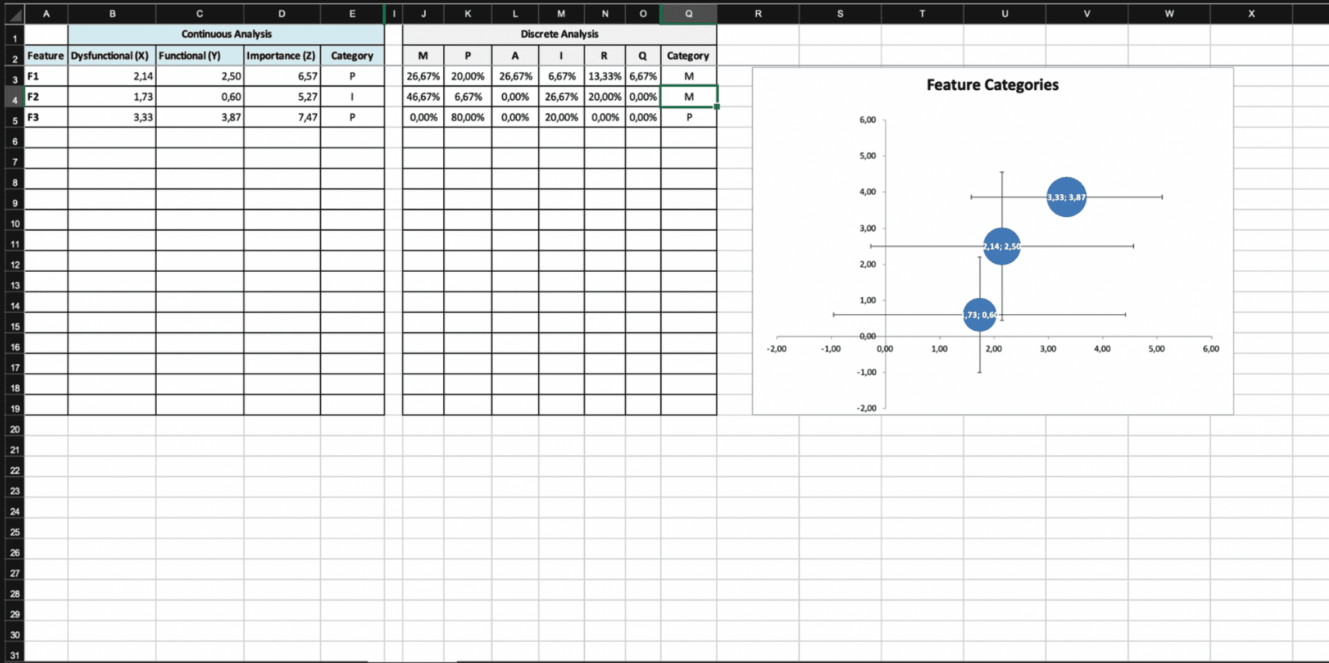
Kano model
I decided to focus on 3 key features for trial. These features have been selected based on their potential impact on user experience and the value they add to the product. The features were tested on 15 participants, the chosen features are:
F1 Personalised Dashboard
F2 Collaborative update sharing
F3 Smart Service Navigator
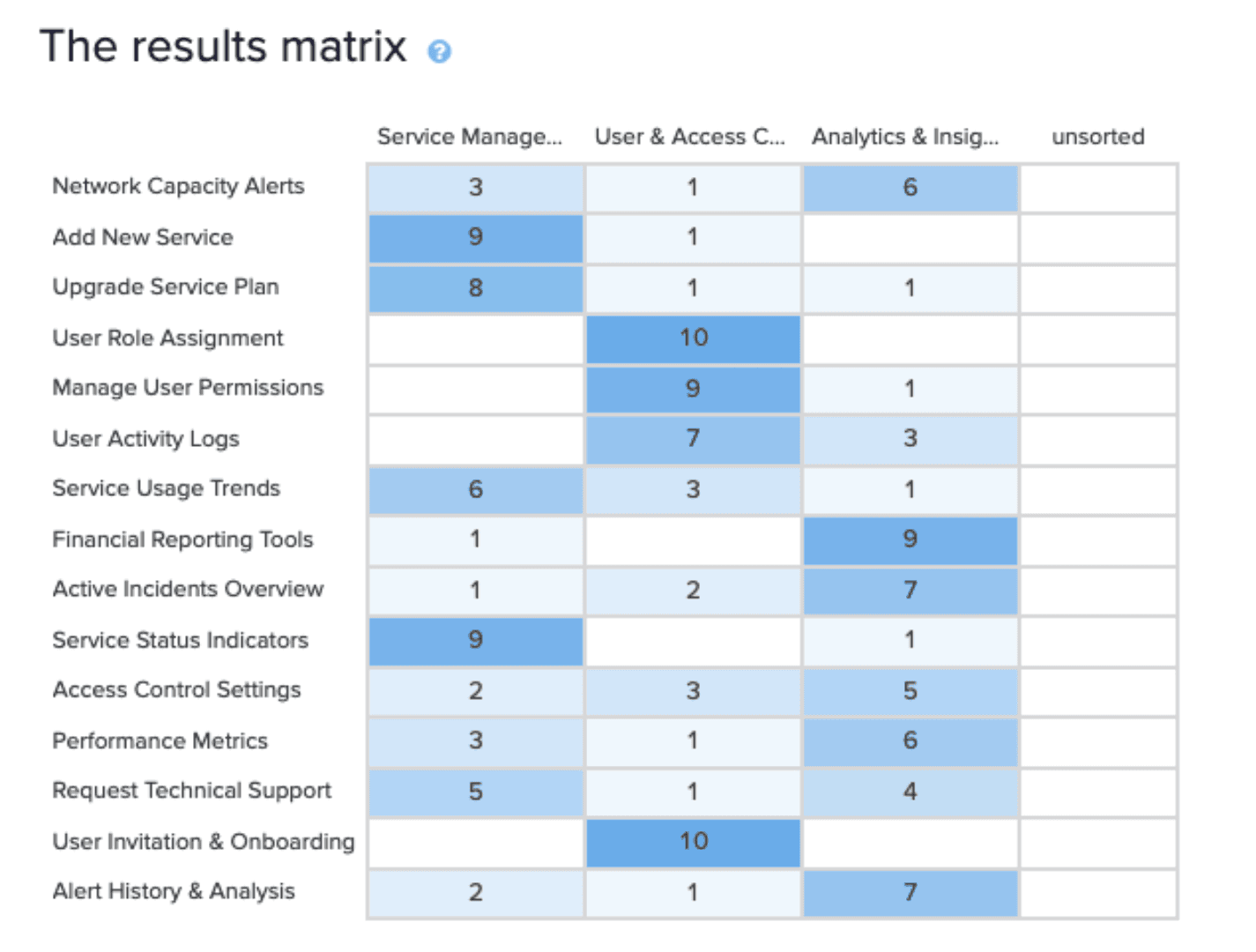
Closed card sorting
I conducted a closed card sorting exercise with 10 participants to refine the information architecture of the customisable dashboard. This method allowed me to observe how users categorised various dashboard elements according to predefined categories.

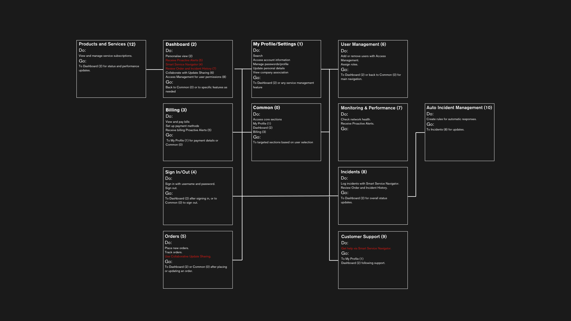
DoGo map
The DoGo map serves as a practical tool for sharing the information architecture of the app. This method allows for visualizing potential navigation paths through a site and facilitates communication between design and development teams without the need for digital tools.
04 Product Design
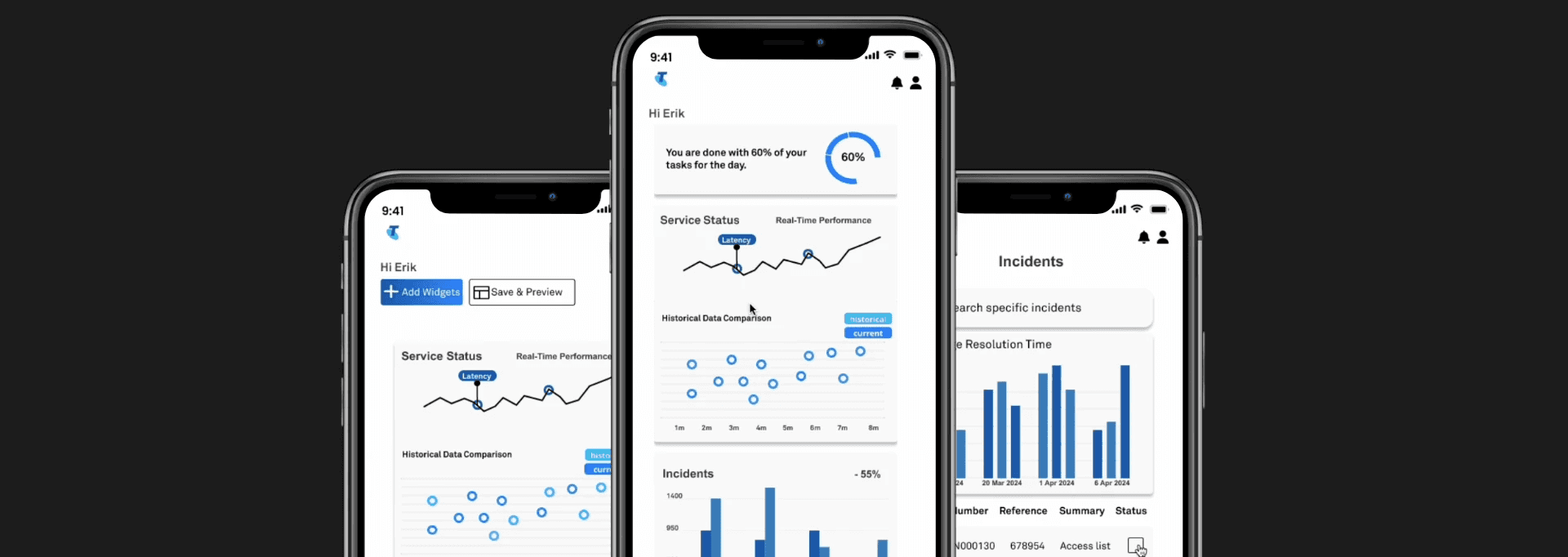
Interactive prototype
The design concept of the customisable dashboard for Telstra Connect revolves around user empoIrment and flexibility. The dashboard allows users to tailor their interface by simply pressing the "Add Widgets" button. This opens a menu where users can choose from a variety of widgets—each representing different features or data elements relevant to their telecom management needs. Adding a widget is as straightforward as selecting it from the menu and placing it on the dashboard.
Outcome